Overview
Today the most widely applied ways of user interaction with apps are either gestures (which is explained by the use of mobile devices) or a computer mouse. But these methods are convenient when we are viewing content. For inputting data we still use a keyboard just like it was some years ago. It can be a virtual keyboard or a real physical device.
In this article, let’s have a look at the developer’s interaction with a virtual keyboard. When we deal with keyboards on mobile Android and iOS devices, 90% of the work is fulfilled by the operating system and framework, and the rest 10% is massively covered in hundreds of articles. If we are talking about the development of solutions for MS Windows, including Delphi, and the VCL framework in particular, the chances to find articles with any ideas and tips for solving typical problems are not very high. But we want to change this situation and we believe that writing this article is one of the ways to do it.
So, it’s time to proceed to the TTouchKeyboard component and the history of its use for the realization of a real task from a client.
TTouchKeyboard use case
When is it recommended to use this component?
- The first reasonable case to use it is when we have a touchscreen. In any case, it is faster to type the necessary data, especially if there is a huge volume of info to add, using a physical device but if you need to input just a few characters (for example, a user’s name, phone number, order number, etc.) and there is a touchscreen, in this case, it can be more convenient to use it without the necessity to turn to a physical device.
- The second use case when it is reasonable to use a virtual keyboard is when the required set of keys is limited. The calculator app is a bright example of the reasons why in such cases it is possible to use a virtual keyboard. It allows users to comfortably input numbers and conduct calculations and view the available functionality of the app. Looking at a virtual keyboard, a user can understand whether the program can calculate sine and cosine, convert values, or can perform only addition and subtraction operations.
If you have access to a touchscreen and the set of the required characters is limited, you should definitely use a virtual keyboard. Of course, you can use a system virtual keyboard. But first of all, it will always look alien in your interface, secondly, you can’t restrict the number of characters, and, thirdly, we, as developers, always feel like inventing something new.
Task setting
We need to build a program that will allow drivers to sign up in a queue for loading goods. The process of registration will be conducted via terminals with a touchscreen in a so-called kiosk regime where a user can get access only to one program that is automatically started in full screen. In the program, a user will need to accept the terms of use, enter an order number and a telephone number, get a registration confirmation code via SMS and enter it, take a printed document, and wait for a new SMS that will notify that it’s already user’s turn to load goods.
Realization
As you can understand from the task itself, we must use TTouchKeyboard. Let’s omit all the points of program realization that are not related to our topic and analyze only the interface.
If it is Wizard, we need to allocate the key place to TCardPanel, this component perfectly suits such tasks and can show a particular Wizard step on every card.
The top part of the form will be a header, let’s paint it in corporate colors and add logos. In the bottom part, let’s add buttons for moving from one step to another, and let’s proceed to the realization of our step of entering an order number.
In the top part of our card, we need to write clarifications. Below, we should add an input field for entering a number and a virtual keyboard. We need to adjust the fonts to the sizes of a 19-inch TouchScreen and add a simple icon in order to use free space in the left part of the screen.
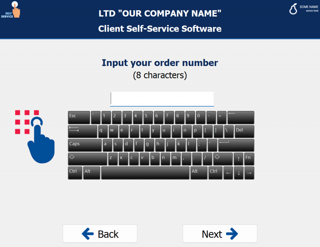
By default, TTouchKeyboard shows the current keyboard layout. As a result, a lot of free space is occupied, keys are small and 90% of the keyboard is not functional in our case due to the fact that an order number includes only 8 numbers and letters won’t be used at all.
Let’s have a look at the customization options that are provided in Object Inspector:
- Color changes the color of a keyboard background
- DrawingStyle changes a background color either by applying color fill from the Color property or gradient fill.
- GradientStart is a gradient fill’s start color
- GradiendEnd is a gradient fill’s end color
- KeyCaptions is a collection for redefining captions on special keys (Esc, Del, Enter, Space, Tab, etc…)
- Layout is a keyboard layout setting, it has two values (Standard and NumPad).
Please pay attention to the fact that the component doesn’t have Events and, consequently, we can’t use them for affecting the behavior and look of the keyboard.
But let’s return to the Layout property. A user needs to input an order number (an 8-digit number), a telephone number (an 8-digit number), and a code from SMS (a 4-digit number) and it means that we can change the layout property to the value NumPad and the situation will be significantly improved.
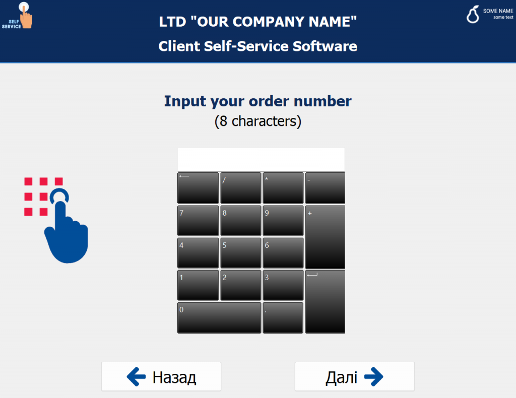
As we do not need a group of buttons, they can be excluded. The keyboard has become more compact and convenient. In such a way, the code could be even suitable for being implemented in production but a grey and black gradient on buttons as well as additional keys with “/”, “-”, “+”, “*”, “.” still spoil the situation. Let’s proceed to the most interesting part – the analysis of sources.
Analysis of original sources
The sources of the TTouchKeyboard code are contained in the Vcl.Touch.Keyboard.pas file. The hierarchy is not complicated at all: TTouchKeyboard-> TCustomTouchKeyboard-> TCustomControl and then a standard hierarchy for all Control in VCL. As it is common in Delphi, a final class TTouchKeyboard doesn’t have any functionality and only adds the preliminarily declared properties to “published”. The TCustomTouchKeyboard class is mainly responsible for the selection of the necessary keyboard layout, sending and modifying messages about button clicks as well as rendering of background under the keys. That’s why TTouchKeyboard has such a small customization set in Object Inspector. The major part of the functionality is hidden in the section dubbed private and its redefinition can’t help to delete extra keys or change their design.
Let’s begin with the presence and place of keys. Layouts are responsible for this functionality. The TTouchKeyboard component looks for layouts in TKeyboardLayouts. The TKeyboardLayouts class keeps all the layouts in a strict private class variable FKeyboardLayouts. The Layouts property as well as methods for search and manipulation of the class data are hidden in the private section as well. We have access only to the methods of loading new layouts LoadFromStream, LoadFromResourceName, as well as LayoutNames with the names of the already loaded layouts.
As it has been found out, developers didn’t try to make this set of components universal. During the initialization, the TKeyboardLayouts class checks all the resources of the app of the RCDATA type and if the resource has the keyword KEYBOARD in its title, TKeyboardLayouts will add it as a layout to its internal list. Where can we get such resources? As there is a string {$R KeyboardLayouts.res} in the Vcl.Touch.Keyboard.pas file, the compiler adds everything that is contained in the KeyboardLayouts.res file to our app. That’s how we get our layouts Standard and NumPad. In reality, we get not just two layouts but the following ones: NumPad and Standard101, Standard102, Standard106 which are variations of the Standard layout for different languages. But we do not need to dive into the details.
From all these facts we can make the following conclusion. For adding a new layout we need either to add it to the resources of our app or to generate it in the runtime and load via TKeyboardLayouts.LoadFromStream. The second method is easier and more logical. That’s why let’s use it. But we also need to have a look at the structure of the layout itself.
To study the mechanism of virtual keyboard layouts, we need to analyze the contents of the file Vcl.Touch.KeyboardTypes.pas. The realization of the TVirtualKeyLayout class is contained there, which represents the layout, as well as the realization of all support classes.
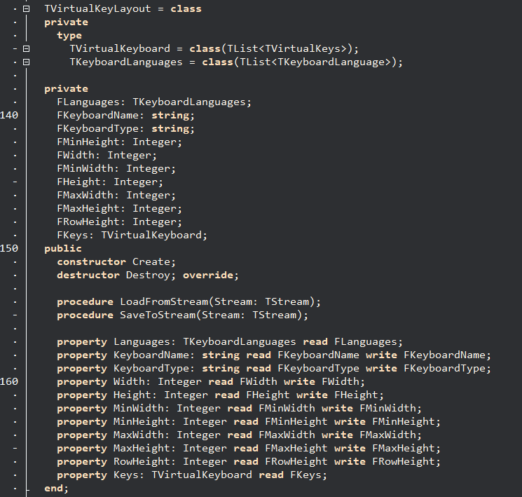
TVirtualKeyLayout has a row of properties that are responsible for dimensions but it will be more interesting for us to have a look at KeyboardName, KeyboardType for naming our layout and the Keys collection of the TVirtualKeyboard type
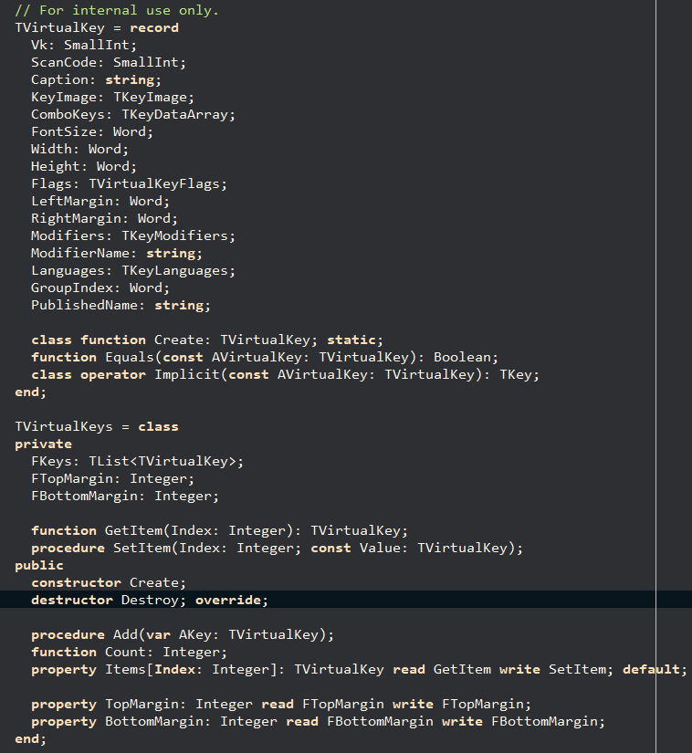
TVirtualKeyboard is a generic list with the TVirtualKeys object type which contains a collection of keys of the TVirtualKey types. TVirtualKeys are rows of keys in the layout and TVirtualKeyboard is a list of rows.
Implementation of keyboard layout
After considering original sources, we’ve understood that for implementing all our plans we need to create our own layout at the initialization stage, then specify its use already in our object TTouchKeyboard, and add to the layout property the same string as it will be indicated in our object of the type TVirtualKeyLayout in the KeyboardType property.
To begin with, we should create our layout and indicate its dimensions by default and minimum dimensions:
| 123456789 | var NumPadMinLayout := TVirtualKeyLayout.Сreate;
try
NumPadMinLayout.KeyboardName := 'NumPadMinimal';
NumPadMinLayout.KeyboardType := 'NumPadMinimal';
NumPadMinLayout.MinHeight := 150;
NumPadMinLayout.MinWidth := 180;
NumPadMinLayout.Height := 229;
NumPadMinLayout.Width := 190;
NumPadMinLayout.RowHeight := 48; |
Then we need to introduce a cycle that will create three key rows:
| 12345 | for var xRowIndex := 0 to 2 do
begin
var KeysRow := TVirtualKeys.Create;
KeysRow.TopMargin := 2;
KeysRow.BottomMargin := 2; |
We also should add a new cycle into the above-mentioned one. This new cycle will create keys in each row:
| 123456789 | for var xColIndex := 0 to 2 do
begin
var xKey := TVirtualKey.Create;
xKey.FontSize := 40;
xKey.Width := 48;
xKey.Height := 48;
xKey.LeftMargin := 2;
xKey.RightMargin := 2;
xKey.KeyImage := kiText; |
Then we need to specify the value of each key. In our first test case, we will emulate numbers from the NumPad keyboard. Number keys NumPad have virtual codes from 0x60 to 0x69 in a hexadecimal number system where 0x60 is the key 0 and 0x69 is 9. You can read more about virtual codes for keys in the official Microsoft documentation (https://learn.microsoft.com/en-us/windows/win32/inputdev/virtual-key-codes). Consequently, the formula for the key code looks the following way:
Let’s add our key to the key row and the row – to the layout:
Done. Now we can save our layout in the stream and then we can upload it to TKeyboardLayouts from this stream:
| 123456789 | var xStream := TMemoryStream.Create();
try
NumPadMinLayout.SaveToStream(xStream);
xStream.Position := 0;
TKeyboardLayouts.LoadFromStream(xStream);
finally
xStream.Free;
end; |
Then, we should assign a string with the name of our layout to the layout of our keyboard, and the first test is conducted.
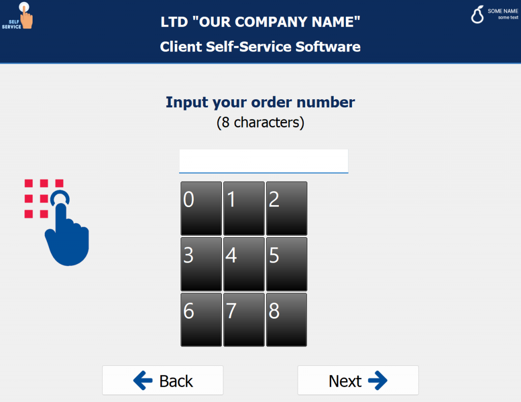
The principle of work is clear which means that we can take out test code as a base and turn the keys in opposite direction and add keys Enter and Backspace.
| 12345678910111213141516171819202122232425262728293031323334353637383940414243444546474849505152535455565758596061626364656667686970717273747576777879808182 | initialization
begin
var NumPadMinLayout := TVirtualKeyLayout.Create;
try
NumPadMinLayout.KeyboardName := 'NumPadMinimal';
NumPadMinLayout.KeyboardType := 'NumPadMinimal';
NumPadMinLayout.MinHeight := 150;
NumPadMinLayout.MinWidth := 180;
NumPadMinLayout.Height := 229;
NumPadMinLayout.Width := 190;
NumPadMinLayout.RowHeight := 48;
for var xRowIndex := 0 to 3 do
begin
var KeysRow := TVirtualKeys.Create;
KeysRow.TopMargin := 2;
KeysRow.BottomMargin := 2;
for var xColIndex := 0 to 3 do
begin
var xAddkey := true;
var xKey := TVirtualKey.Create;
xKey.FontSize := 40;
xKey.Width := 48;
xKey.Height := 48;
xKey.LeftMargin := 2;
xKey.RightMargin := 2;
xKey.KeyImage := kiText;
if xColIndex = 3 then
begin
case xRowIndex of
0 : begin
xKey.Vk := -1;
xKey.ScanCode := 14;
xKey.KeyImage := kiBackspace;
xKey.Flags := [kfStretch];
xKey.Height := xKey.Height * 2;
end;
2 : begin
xKey.Vk := VK_RETURN;
xKey.ScanCode := -1;
xKey.KeyImage := kiTallEnter;
xKey.Flags := [kfStretch];
xKey.Height := xKey.Height * 2;
xKey.PublishedName := 'Enter';
end;
else
xAddkey := false;
end;
end
else
begin
if xRowIndex = 3 then begin
if xColIndex = 0 then begin
xKey.Vk := $60;
xKey.Width := xKey.Width * 3;
end else
xAddkey := false;
end else
xKey.Vk := $69 – xRowIndex * 3 – (2 – xColIndex);
end;
if xAddkey then
KeysRow.Add(xKey);
end{for};
NumPadMinLayout.Keys.Add(KeysRow);
end{for};
var xStream := TMemoryStream.Create();
try
NumPadMinLayout.SaveToStream(xStream);
xStream.Position := 0;
TKeyboardLayouts.LoadFromStream(xStream);
finally
xStream.Free;
end;
finally
NumPadMinLayout.Free;
end;
end; |
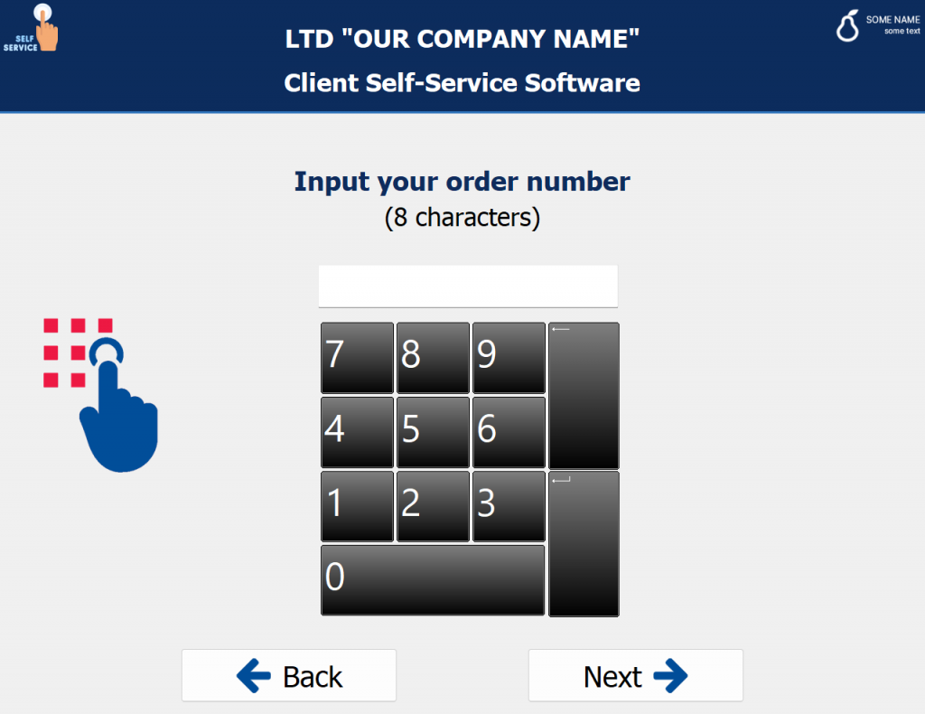
Now on the screen, we can see only those keys that are required. But we need to understand how we can make them look more up-to-date.
To do it, it is required to return to the implementation of the TCustomTouchKeyboard class and to consider the source code of the Paint method. Here we do not need to pay attention to the part of the code that is related to the background rendering, we should concentrate on the rendering of keys:
From this code, you can see that the code of the keyboard component checks every key in its collection and calls their rendering on its canvas. Each key can draw itself. Now let’s proceed to the class of the button TCustomKeyboardButton and we will see that the rendering method is virtual. It means that it can be redefined in the descendant:
After an attentive consideration of the TCustomTouchKeyboard class we will find the public DefaultButtonClass property. It means that we can use our descendant class on the keyboard. Let’s start the implementation, specify our descendant class, and redefine the rendering method:
| 1234 | TFlatButtonClass = class(TCustomKeyboardButton)
public
procedure Paint(Canvas: TCustomCanvas = nil); override;
end; |
The rendering of symbols for the keys Enter and Backspace should be conducted in a manual regime MoveTo\LineTo which doesn’t look very pretty in our layout especially when we have a bold font. That’s why we should make it possible to use icons for these keys. As not we but the keyboard itself will be responsible for the creation and lifecycle management of the TFlatButtonClass objects, we can’t add the necessary parameters for each object. Recompilation will eliminate the possibility to use the same code in other projects, moreover, it is not the best idea from an ethical perspective. That’s why we should create “class variables” and specify them once at the initialization stage:
| 1234567 | TFlatButtonClass = class(TCustomKeyboardButton)
class var Images : TCustomImageList;
class var EnterImageIndex : integer;
class var BackspaceImageIndex : integer;
public
procedure Paint(Canvas: TCustomCanvas = nil); override;
end; |
Also we need to declare a class for opening access to the protected-section of the TCustomTouchKeyboard class:
The realization of the Paint method can be fully copied from TCustomKeyboardButton and in parallel we can start to introduce our changes to it for getting the desired design of keys. For example, in our case the code for rendering the keys Enter and Backspace can look the following way:
| 12345678910111213141516171819202122232425 | procedure PaintTallEnter(Canvas: TCustomCanvas; Rect: TRect);
begin
if Assigned(Images) then
begin
Images.Draw(
Canvas as TCanvas,
Rect.CenterPoint.X – Images.Width div 2,
Rect.CenterPoint.Y – Images.Height div 2,
EnterImageIndex
);
end;
end;
procedure PaintBackspace(Canvas: TCustomCanvas; Rect: TRect);
begin
if Assigned(Images) then
begin
Images.Draw(
Canvas as TCanvas,
Rect.CenterPoint.X – Images.Width div 2,
Rect.CenterPoint.Y – Images.Height div 2,
BackspaceImageIndex
);
end;
end; |
As for the constants for rendering background, we can modify them as follows:
| 123 | const
BkStartColors: array[TDrawState] of TColor = ($00221d1e, $4d4546, clGray);
BkEndColors: array[TDrawState] of TColor = ($00221d1e, $4d4546, clCream); |
We had to eliminate some functionality due to the peculiarities of the class hierarchy. For example, we do not have access to the realization of GetOverrideCaption and GetModifier but it is not a problem as we do not need to have such functionality in our program.
Let’s add the initialization code:
| 123456789 | procedure TForm2.FormShow(Sender: TObject);
begin
TFlatButtonClass.Images := vilKeyboardImages_64;
TFlatButtonClass.EnterImageIndex := vilKeyboardImages_64.GetIndexByName('Enter');
TFlatButtonClass.BackspaceImageIndex := vilKeyboardImages_64.GetIndexByName('Backspace');
TouchKeyboard2.DefaultButtonClass := TFlatButtonClass;
TouchKeyboard2.Layout := 'NumPadMinimal';
end; |
As a result, we will have an acceptable minimalistic design:
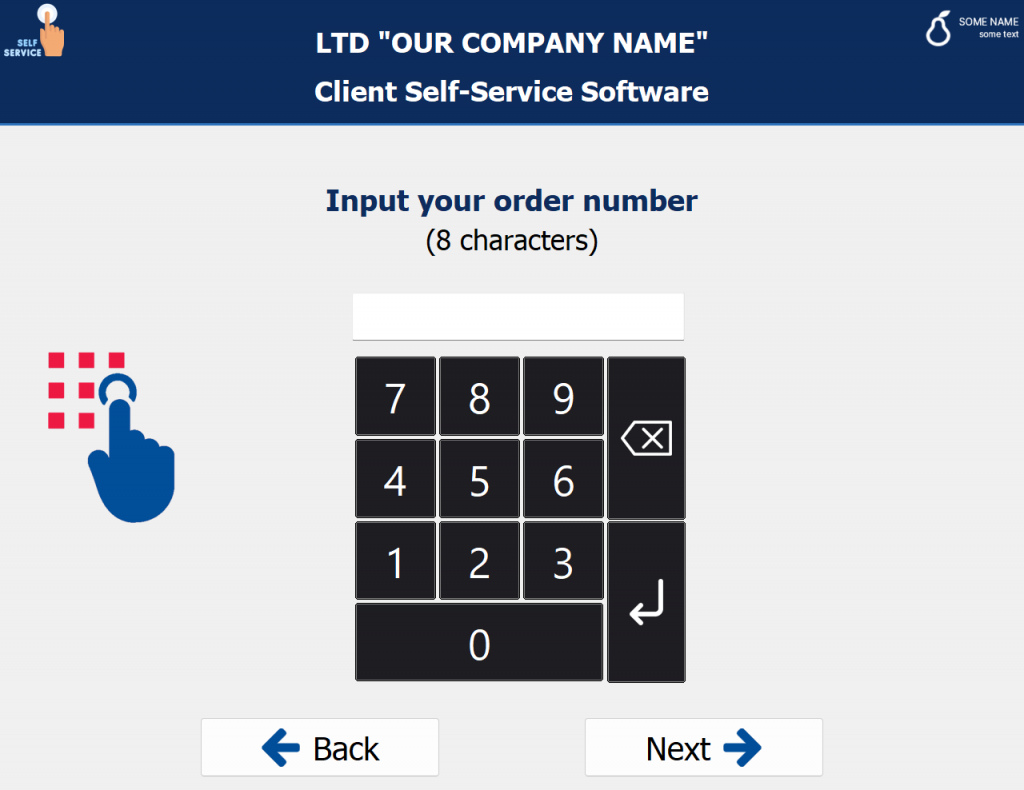
Full source code of a module with own keys and layout realization:
| 123456789101112131415161718192021222324252627282930313233343536373839404142434445464748495051525354555657585960616263646566676869707172737475767778798081828384858687888990919293949596979899100101102103104105106107108109110111112113114115116117118119120121122123124125126127128129130131132133134135136137138139140141142143144145146147148149150151152153154155156157158159160161162163164165166167168169170171172173174175176177178179180181182183184185186187188189190191192193194195196197198199200201202203204205206207208209210211212213214215216217218219220221222223224225226227228229230231232233234235236237238239240241242243244245246247248249250251252253254255256257258259260261262263264265266267268269270271272273274275276277278279280281282283284285286287288289290291292293294295296297298299300301302303304305306307308309310311312313314315316317318319320321322323324325326327328329330331332333334335336337338339340341342343344345346347 | unit uTouchKeyboard;
interface
uses
Vcl.Touch.KeyboardTypes, vcl.Touch.Keyboard, Winapi.Windows, vcl.Graphics,
Vcl.ImgList, Vcl.GraphUtil, System.Classes;
type
TFlatButtonClass = class(TCustomKeyboardButton)
class var Images : TCustomImageList;
class var EnterImageIndex : integer;
class var BackspaceImageIndex : integer;
public
procedure Paint(Canvas: TCustomCanvas = nil); override;
end;
implementation
type
TOpenTouchKeyboard = class(TCustomTouchKeyboard);
{ TFlatButtonClass }
procedure TFlatButtonClass.Paint(Canvas: TCustomCanvas);
const
ICON_TOP_OFFSET = 8;
ICON_LEFT_OFFSET = 4;
procedure PaintTab(Canvas: TCustomCanvas; Rect: TRect);
const
ICON_WIDTH = 36;
ICON_HEIGHT = 12;
begin
// Top line
Canvas.MoveTo(Rect.Left + ICON_LEFT_OFFSET, Rect.Top + ICON_TOP_OFFSET);
Canvas.LineTo(Rect.Left + ICON_LEFT_OFFSET + ICON_WIDTH, Rect.Top + ICON_TOP_OFFSET);
// Top vertical line
Canvas.MoveTo(Rect.Left + ICON_LEFT_OFFSET, Rect.Top + ICON_TOP_OFFSET – 5);
Canvas.LineTo(Rect.Left + ICON_LEFT_OFFSET, Rect.Top + ICON_TOP_OFFSET + 5);
// Top arrow
Canvas.MoveTo(Rect.Left + ICON_LEFT_OFFSET + 2, Rect.Top + ICON_TOP_OFFSET – 1);
Canvas.LineTo(Rect.Left + ICON_LEFT_OFFSET + 2, Rect.Top + ICON_TOP_OFFSET + 2);
Canvas.MoveTo(Rect.Left + ICON_LEFT_OFFSET + 3, Rect.Top + ICON_TOP_OFFSET – 2);
Canvas.LineTo(Rect.Left + ICON_LEFT_OFFSET + 3, Rect.Top + ICON_TOP_OFFSET + 3);
// Bottom line
Canvas.MoveTo(Rect.Left + ICON_LEFT_OFFSET, Rect.Top + ICON_TOP_OFFSET + ICON_HEIGHT);
Canvas.LineTo(Rect.Left + ICON_LEFT_OFFSET + ICON_WIDTH + 1, Rect.Top + ICON_TOP_OFFSET + ICON_HEIGHT);
// Bottom vertical line
Canvas.MoveTo(Rect.Left + ICON_LEFT_OFFSET + ICON_WIDTH, Rect.Top + ICON_TOP_OFFSET + ICON_HEIGHT – 5);
Canvas.LineTo(Rect.Left + ICON_LEFT_OFFSET + ICON_WIDTH, Rect.Top + ICON_TOP_OFFSET + ICON_HEIGHT + 5);
// Bottom arrow
Canvas.MoveTo(Rect.Left + ICON_LEFT_OFFSET + ICON_WIDTH – 2, Rect.Top + ICON_TOP_OFFSET + ICON_HEIGHT – 1);
Canvas.LineTo(Rect.Left + ICON_LEFT_OFFSET + ICON_WIDTH – 2, Rect.Top + ICON_TOP_OFFSET + ICON_HEIGHT + 2);
Canvas.MoveTo(Rect.Left + ICON_LEFT_OFFSET + ICON_WIDTH – 3, Rect.Top + ICON_TOP_OFFSET + ICON_HEIGHT – 2);
Canvas.LineTo(Rect.Left + ICON_LEFT_OFFSET + ICON_WIDTH – 3, Rect.Top + ICON_TOP_OFFSET + ICON_HEIGHT + 3);
end;
procedure PaintEnter(Canvas: TCustomCanvas; Rect: TRect);
const
ICON_WIDTH = 36;
ICON_HEIGHT = 12;
begin
// Horizontal line
Canvas.MoveTo(Rect.Left + ICON_LEFT_OFFSET + ICON_WIDTH, Rect.Top + ICON_HEIGHT – 6);
Canvas.LineTo(Rect.Left + ICON_LEFT_OFFSET + ICON_WIDTH, Rect.Top + ICON_HEIGHT + 1);
// Vertical line
Canvas.MoveTo(Rect.Left + ICON_LEFT_OFFSET, Rect.Top + ICON_HEIGHT);
Canvas.LineTo(Rect.Left + ICON_LEFT_OFFSET + ICON_WIDTH, Rect.Top + ICON_HEIGHT);
// Arrow
Canvas.MoveTo(Rect.Left + ICON_LEFT_OFFSET + 1, Rect.Top + ICON_HEIGHT – 1);
Canvas.LineTo(Rect.Left + ICON_LEFT_OFFSET + 1, Rect.Top + ICON_HEIGHT + 2);
Canvas.MoveTo(Rect.Left + ICON_LEFT_OFFSET + 2, Rect.Top + ICON_HEIGHT – 2);
Canvas.LineTo(Rect.Left + ICON_LEFT_OFFSET + 2, Rect.Top + ICON_HEIGHT + 3);
end;
procedure PaintTallEnter(Canvas: TCustomCanvas; Rect: TRect);
begin
if Assigned(Images) then
begin
Images.Draw(
Canvas as TCanvas,
Rect.CenterPoint.X – Images.Width div 2,
Rect.CenterPoint.Y – Images.Height div 2,
EnterImageIndex
);
end;
end;
procedure PaintBackspace(Canvas: TCustomCanvas; Rect: TRect);
begin
if Assigned(Images) then
begin
Images.Draw(
Canvas as TCanvas,
Rect.CenterPoint.X – Images.Width div 2,
Rect.CenterPoint.Y – Images.Height div 2,
BackspaceImageIndex
);
end;
end;
procedure PaintShift(Canvas: TCustomCanvas; Rect: TRect);
begin
Canvas.MoveTo(Rect.Left + ICON_LEFT_OFFSET, Rect.Top + 4 + 12);
Canvas.LineTo(Rect.Left + ICON_LEFT_OFFSET + 10, Rect.Top + 6);
Canvas.LineTo(Rect.Left + ICON_LEFT_OFFSET + 20, Rect.Top + 4 + 12);
Canvas.LineTo(Rect.Left + ICON_LEFT_OFFSET + 14, Rect.Top + 4 + 12);
Canvas.LineTo(Rect.Left + ICON_LEFT_OFFSET + 14, Rect.Top + 4 + 18);
Canvas.LineTo(Rect.Left + ICON_LEFT_OFFSET + 6, Rect.Top + 4 + 18);
Canvas.LineTo(Rect.Left + ICON_LEFT_OFFSET + 6, Rect.Top + 4 + 12);
Canvas.LineTo(Rect.Left + ICON_LEFT_OFFSET, Rect.Top + 4 + 12);
end;
procedure PaintArrow(Canvas: TCustomCanvas; Rect: TRect; Direction: TKeyImage);
const
ICON_WIDTH = 8;
ICON_HEIGHT = 8;
var
X, Y: Integer;
begin
X := (Rect.Left + Rect.Right) div 2;
Y := (Rect.Top + Rect.Bottom) div 2;
case Direction of
kiUp:
begin
// Vertical line
Canvas.MoveTo(X, Y – ICON_HEIGHT);
Canvas.LineTo(X, Y + ICON_HEIGHT);
// Arrow
Canvas.MoveTo(X – 1, Y – 7);
Canvas.LineTo(X + 2, Y – 7);
Canvas.MoveTo(X – 2, Y – 6);
Canvas.LineTo(X + 3, Y – 6);
end;
kiDown:
begin
// Vertical line
Canvas.MoveTo(X, Y – ICON_HEIGHT);
Canvas.LineTo(X, Y + ICON_HEIGHT);
// Arrow
Canvas.MoveTo(X – 1, Y + 6);
Canvas.LineTo(X + 2, Y + 6);
Canvas.MoveTo(X – 2, Y + 5);
Canvas.LineTo(X + 3, Y + 5);
end;
kiLeft:
begin
// Vertical line
Canvas.MoveTo(X – ICON_WIDTH, Y);
Canvas.LineTo(X + ICON_WIDTH, Y);
// Arrow
Canvas.MoveTo(X – 6, Y – 1);
Canvas.LineTo(X – 6, Y + 2);
Canvas.MoveTo(X – 5, Y – 2);
Canvas.LineTo(X – 5, Y + 3);
end;
kiRight:
begin
// Vertical line
Canvas.MoveTo(X – ICON_WIDTH, Y);
Canvas.LineTo(X + ICON_WIDTH, Y);
// Arrow
Canvas.MoveTo(X + 6, Y – 1);
Canvas.LineTo(X + 6, Y + 2);
Canvas.MoveTo(X + 5, Y – 2);
Canvas.LineTo(X + 5, Y + 3);
end;
end;
end;
const
Rounding = 5;
OuterEdgeColors: array[TDrawState] of TColor = (clBlack, clBlack{clCream}, clCream);
InnerEdgeColors: array[TDrawState] of TColor = (clGray, clDkGray, clGray);
// BkStartColors: array[TDrawState] of TColor = (clDkGray, clCream, clGray);
// BkEndColors: array[TDrawState] of TColor = (clBlack, clLtGray, clCream);
BkStartColors: array[TDrawState] of TColor = ($00221d1e, $4d4546, clGray);
BkEndColors: array[TDrawState] of TColor = ($00221d1e, $4d4546, clCream);
TextColors: array[TDrawState] of TColor = (clWhite, clWhite{clBlack}, clGray);
var
LRgn: HRGN;
LRect: TRect;
LCanvas: TCanvas;
LCaption: string;
Modifier: TKeyModifier;
begin
if Canvas <> nil then
LCanvas := Canvas as TCanvas
else
LCanvas := TOpenTouchKeyboard(Parent).Canvas;
// LCanvas := nil;
LRect := ClientRect;
Inc(LRect.Right, 1);
Inc(LRect.Bottom, 1);
LRgn := CreateRoundRectRgn(LRect.Left, LRect.Top, LRect.Right, LRect.Bottom,
Rounding, Rounding);
if LRgn = 0 then
Exit;
try
if SelectClipRgn(LCanvas.Handle, LRgn) = ERROR then
Exit;
try
GradientFillCanvas(LCanvas, BkStartColors[State],
BkEndColors[State], LRect, gdVertical);
LCanvas.Brush.Style := bsClear;
LCanvas.Pen.Color := OuterEdgeColors[State];
Dec(LRect.Right, 1);
Dec(LRect.Bottom, 1);
LCanvas.RoundRect(LRect, Rounding, Rounding);
LCanvas.Pen.Color := InnerEdgeColors[State];
LCanvas.Brush.Style := bsClear;
InflateRect(LRect, -1, -1);
LCanvas.RoundRect(LRect, Rounding – 1, Rounding – 1);
LCanvas.Pen.Color := TextColors[State];
LCanvas.Font.Color := TextColors[State];
// if GetModifier(Key, Modifier) then
// LCanvas.Font.Size := Modifier.FontSize
// else
LCanvas.Font.Size := Key.FontSize;
case KeyImage of
kiOverride:
begin
// if not Parent.GetOverrideCaption(Key, LCaption) then
LCaption := Caption;
LCanvas.TextOut(LRect.Left + 4, LRect.Top + 4, LCaption);
end;
kiText: LCanvas.TextOut(
LRect.CenterPoint.X – LCanvas.TextWidth(Caption) div 2,
LRect.CenterPoint.Y – LCanvas.TextHeight(Caption) div 2,
Caption
);
kiTab: PaintTab(LCanvas, LRect);
kiShift: PaintShift(LCanvas, LRect);
kiEnter: PaintEnter(LCanvas, LRect);
kiBackspace: PaintBackspace(LCanvas, LRect);
kiUp, kiDown,kiLeft, kiRight: PaintArrow(LCanvas, LRect, KeyImage);
kiTallEnter: PaintTallEnter(LCanvas, LRect);
end;
finally
SelectClipRgn(LCanvas.Handle, 0);
end;
finally
DeleteObject(LRgn);
end;
end;
initialization
begin
var NumPadMinLayout := TVirtualKeyLayout.Create;
try
NumPadMinLayout.KeyboardName := 'NumPadMinimal';
NumPadMinLayout.KeyboardType := 'NumPadMinimal';
NumPadMinLayout.MinHeight := 150;
NumPadMinLayout.MinWidth := 180;
NumPadMinLayout.Height := 229;
NumPadMinLayout.Width := 190;
NumPadMinLayout.RowHeight := 48;
for var xRowIndex := 0 to 3 do
begin
var KeysRow := TVirtualKeys.Create;
KeysRow.TopMargin := 2;
KeysRow.BottomMargin := 2;
for var xColIndex := 0 to 3 do begin
var xAddkey := true;
var xKey := TVirtualKey.Create;
xKey.FontSize := 40;
xKey.Width := 48;
xKey.Height := 48;
xKey.LeftMargin := 2;
xKey.RightMargin := 2;
xKey.KeyImage := kiText;
if xColIndex = 3 then
begin
case xRowIndex of
0 : begin
xKey.Vk := -1;
xKey.ScanCode := 14;
xKey.KeyImage := kiBackspace;
xKey.Flags := [kfStretch];
xKey.Height := xKey.Height * 2;
end;
2 : begin
xKey.Vk := VK_RETURN;
xKey.ScanCode := -1;
xKey.KeyImage := kiTallEnter;
xKey.Flags := [kfStretch];
xKey.Height := xKey.Height * 2;
xKey.PublishedName := 'Enter';
end;
else
xAddkey := false;
end;
end
else
begin
if xRowIndex = 3 then begin
if xColIndex = 0 then begin
xKey.Vk := $60;
xKey.Width := xKey.Width * 3;
end else
xAddkey := false;
end else
xKey.Vk := $69 – xRowIndex * 3 – (2 – xColIndex);
end{if..else};
if xAddkey then
KeysRow.Add(xKey);
end{for};
NumPadMinLayout.Keys.Add(KeysRow);
end{for};
var xStream := TMemoryStream.Create();
try
NumPadMinLayout.SaveToStream(xStream);
xStream.Position := 0;
TKeyboardLayouts.LoadFromStream(xStream);
finally
xStream.Free;
end;
finally
NumPadMinLayout.Free;
end;
end;
end. |


